


Bitcoin Network Imaging (BNI) Report
Introducing the new NeuroInvest Research algorithmic analysis which examines the depths of Bitcoin's ecosystem - Today's issue has the spotlight on Realized Price & MVRV Ratio

NeuroInvest Research is excited to introduce an ongoing project - the Bitcoin Network Imaging (BNI) dashboard. The goal of this dashboard is to create algorithmic oversight into market conditions, specifically behaviors occurring in the Bitcoin ecosystem. The following analysis will sift through the complexities of the information recorded by Bitcoin’s transparent blockchain ledger, and digest it into a readable and comprehensible manner. The publication series begins with the exploration of Bitcoin’s system, and will gradually incorporate a variety of exogenous forces that impact the analysis; giving us a comprehensive understanding of all the market dynamics at play.
Let’s jump right in!
Examining Bitcoin’s fair value
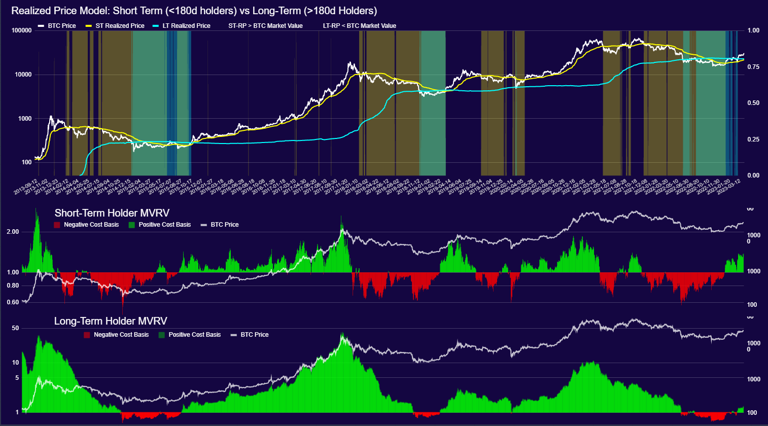
Today, the spotlight is on examining Bitcoin’s fair value. In other words, estimating the unbiased and truer market value of an asset. One way of doing this is by assessing the average settlement value occurring on-chain. This can be done by looking at a fundamental metric known as Realized Price (Figure 1.0).
Realized Price: measures the aggregate value of Bitcoin based on the price at which each coin was last transacted (last moved P2P on-chain), and weighted by the total supply in circulation. In other words, realized price can be considered the average settlement value of Bitcoin on-chain (cost basis).
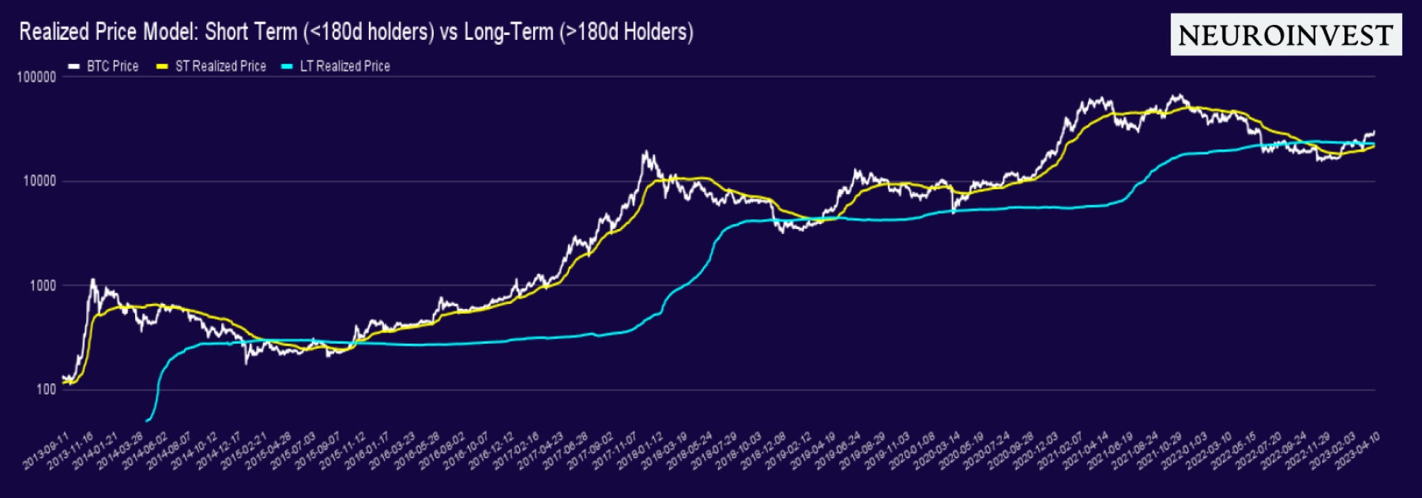
Example: For the sake of simplicity, let’s Imagine there are only 3 Bitcoins in existence. Frodo last moved 1 Bitcoin when the price was $10,000. Gandalf moved 1 Bitcoin at $15,000, and Samwise transferred 1 Bitcoin at $20,000. The realized cap for this simplified Bitcoin network would be - the sum of the value of all coins at the price when they last moved: ($10,000 + $15,000 + $20,000) = $45,000. The Realized Price takes that sum and divides that by the total supply in circulation, giving us an average (on-chain) settlement value of $15,000.
Realized price is similar to the common market cap metric, which measures the total value of a company's stock shares. In contrast to market cap, realized price gives a more constructive, and organic consensus price amongst active participants. Figure 2.0 presents a visual of realized price (blue / yellow line) against BTC market value.
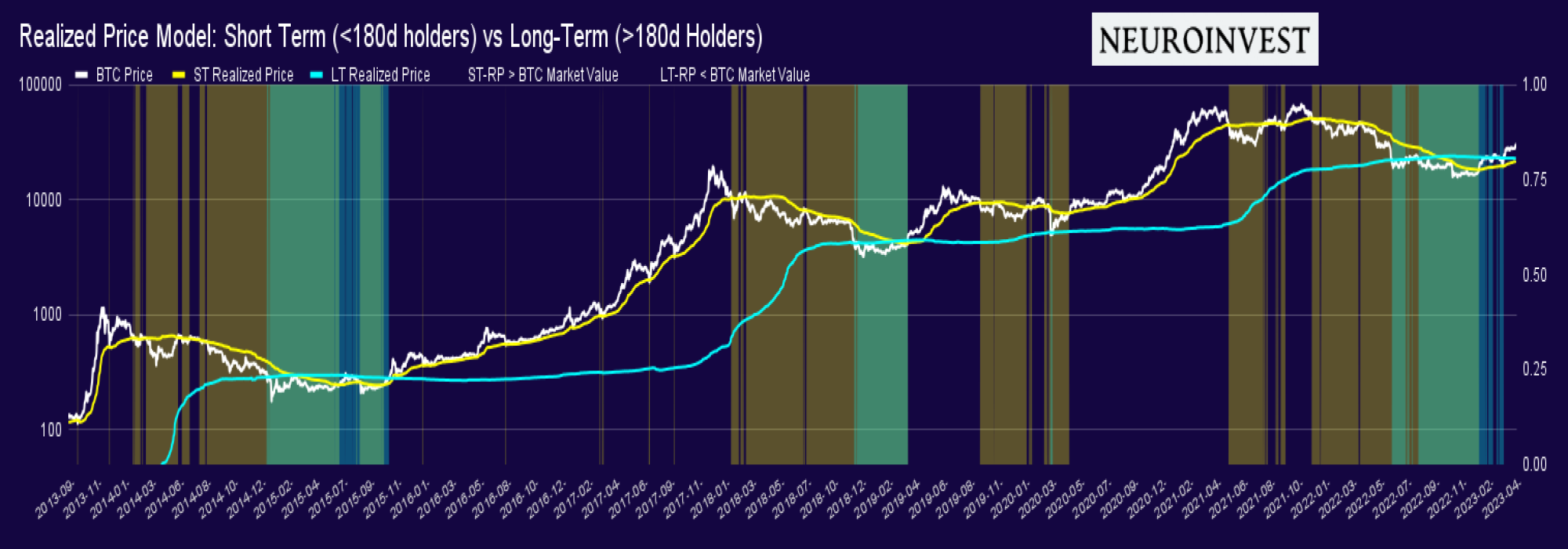
By separating the cost basis of these 2 cohorts, we get exclusive information about each cohort and their subsequent response to various inflection points in the market cycles.
Despite the strong signals it emits, realized price tells us one side of the story. Conversely, market cap, a metric that is highly susceptible to exogenous forces, also merits consideration. Interestingly, throughout his career, Robert Shiller has argued that market cap, despite being the consensus price among active market participants, is marred by the inaccuracies inherent to the Efficient Market Hypothesis. Shiller deems the market cap an unreliable source of truth.
The fact is, market cap overlooks the important fundamental factors, such as revenue, profitability, growth, leverage and so forth; underlying forces which bring us further away from fair value of an asset.
Why introduce market cap then?
The importance of recognizing the forces that influence these two very different storytelling metrics is pivotal to our analysis. Reflecting on Shiller’s initial hypothesis, taking Bitcoin’s market cap and comparing it against the realized price, we get a ratio that can help us determine the relative level dispersion between Bitcoin’s current price (market cap) and the truer cost of Bitcoin’s price (realized price). This ratio is commonly referred to as MVRV (market value to realized value) - figure 3.0.
MVRV Ratio: A metric that looks at the market’s perceived value of Bitcoin (market cap) and assesses its relation to the underlying settlement value occuring on-chain, which you now should know as Realized Price.
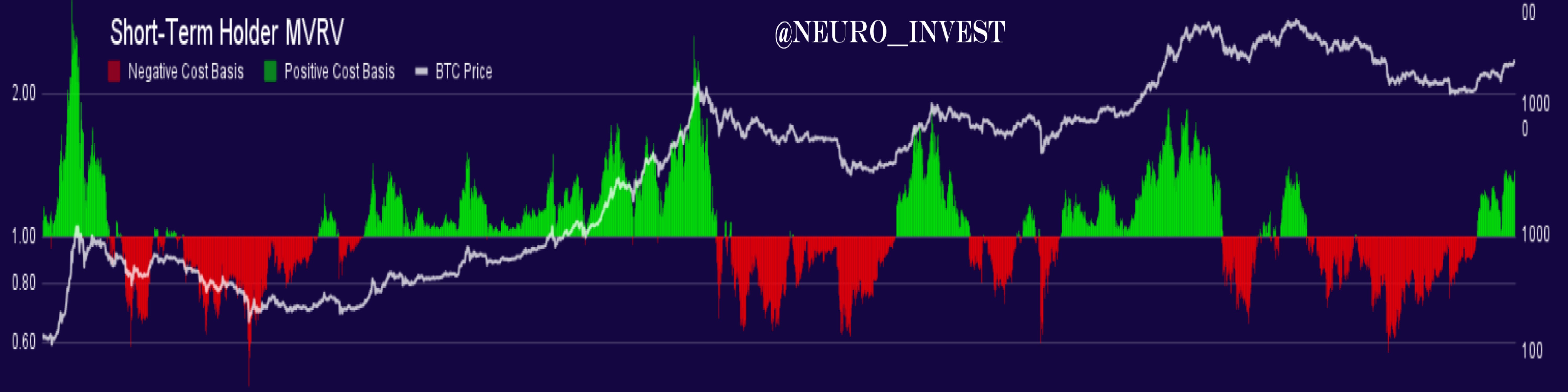
Figure 3.0 demonstrates the MVRV ratio for ST holders (<180d). In essence the graph tells us: are the ST holder in a state of state of profit (green) or loss (red).
Since the FTX debacle, BTC activated some historic alert signals. On june 18th, 22, short-term holders experienced one of the greatest setbacks in their portfolios. This is displayed in the amount of red (net negative unrealized loss) the ST holders displaced in the MVRV graph above. Since then, as bitcoin’s market price moved, the rate at which these participants started acquiring coin became considerably more noticeable, pushing the average cost basis of these coin holders into net positive territory.
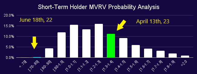
Assuming that realized price brings us to the true cost of Bitcoin, it no question that buyers kept defending price targets at the lows experienced on June 18th. If the implied probability assumptions were correct, Bitcoin was experiencing a fire sale opportunity when comparing historic analogs, as displayed in figure 4.0 in the probability distribution curve.
Brief Market Diagnostics
(for more advanced users)
As of today (2023-04-13), Bitcoin sits at $30,311 USD, and as previously mentioned, there’s been a great deal of demand at the lows of $15k. The green portrayed in the ST and LT realized price demonstrates a great deal of spot demand, a change of dynamics from the previous Bitcoin double top when it surged to a price shy of 70k. At this time, there was significantly less spot interest, leaving Bitcoin exposed to external forces, i.e. leverage / futures markets.
Today, that dynamic has changed and the strong spot demand is a signal for a strong base of support for the future of BTC.
Signs of Realized Gains
Utilizing the blockchain data, we can observe the behaviour of various cohorts through the amount of BTC they hold in their address.
In accordance with the heatmap displayed in figure 6.0 , larger address have been decreasing their their positions on a net relative 30 day basis. Smaller addresses are still displaying signs of accumulation.
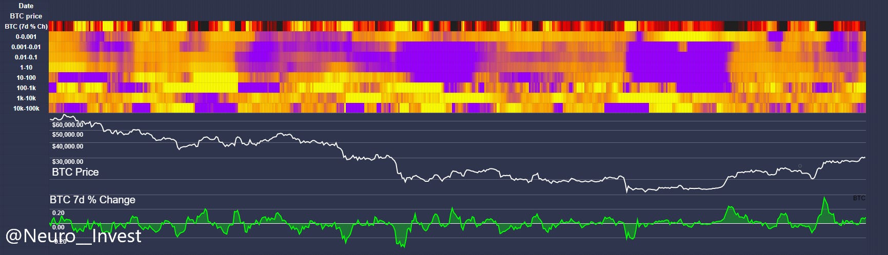
Figure 7.0 presents a similar story but looking at the absolute value of coin movement, once again measured by the wallet size in units of BTC. As displayed in the graph, larger wallets have been decreasing their positions: 10-100 transferring an estimated sum of $74,918,841 USD, 100-1k wallets following suit with $1,967,388,948 over the last month. Still, the estimate total movement of coin is sitting in net positive territory since last week and last month = 7.07%.
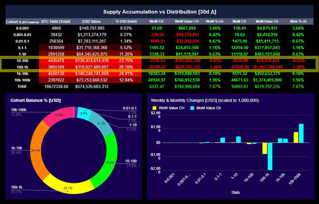
Curious about the measurements?: The data above identifies each cohort by the amount of coin [BTC] held on-chain (1-10, 10-100 etc.). Through this, we can determine whether these cohorts are increasing their balance (accumulation = purple) or decreasing - (distribution = yellow).
The data is measured by the rate at which these cohorts move their coin (in/out) on a 30 day relative basis. The greater the relative change over a 30d period, the greater the the rate at which these cohorts are increasing or decreasing their balance. The color spectrum measures the spread, or the dispersion of relative change from the average.
In statistics, this is referred to as "σ" (sigma), used to represent the standard deviation of a population or a sample.
By examining various metrics and data sources, we can obtain a more comprehensive understanding of the market dynamics at play, and ultimately reinforce the validity of our conclusions.
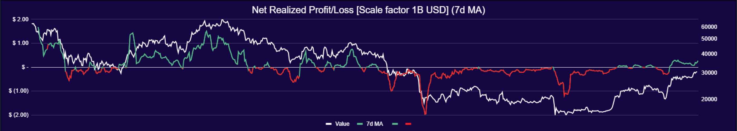
In line with recent findings, there is multiple signs of demand for BTC. However, with BTC moving up shy of 100% from the bottom of 15k, certain addresses are demonstrating some signs of selling; albeit not significant, the transition to an environment of profitability is leading certain addresses to realize their recent gains. This is can also be displayed in the following graphs: Net Realized Profit/Loss (Figure 9.0)
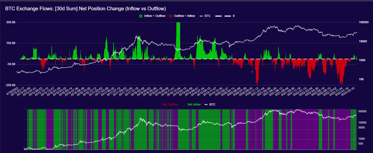
Some signs of BTC liquidity outflows. Which corresponds to the potential tell-tale signs of liquidity entering exchanges. If this rings true to historical analogs, BTC moving off exchanges tends to imply seller sentiment - displayed in figure 10.0
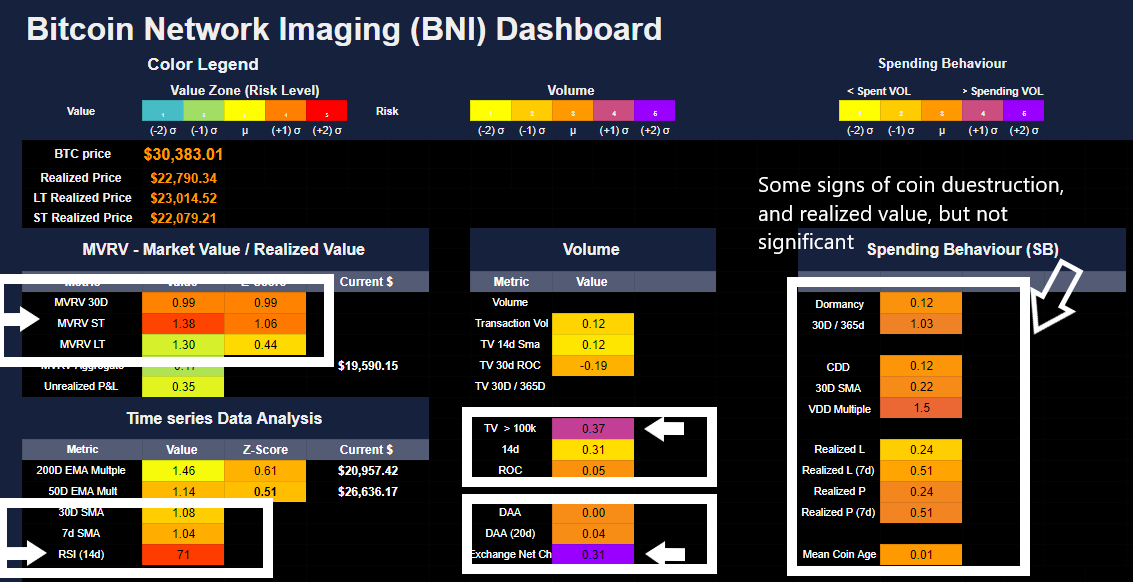
Last but not least, here we have the BNI dashboard. The widescope overview of the behavioural activity occurring on-chain. Which I won’t dive too deep into this time around, as I know the attention span of most is limited to short and concise readings, which I hope I’ve accomplished in this issue.
However, if you are interested in this, please feel free to ask or message.
Quick take summary:
Based on our probabilistic outlook, bullish signs for the long-term are definitely growing; however, it should not come unexpected to see some light in volatility, and hence the potential for some price swings down. Especially given that the some models are beginning to show signs of profit taking. Also, it’s important to note, the macro conditions are still displaying recessionary signs. Even though Bitcoin has recently disconnected from its correlation to risk-on assets, is it enough for people to consider this a safe haven asset and resume a self reinforcing bullish trend?
NOT INVESTMENT ADVICE
I hope you enjoyed this analyses. Please like and subscribe, it helps me out tremendously.
NeuroInvest Signing Off…